Ilustraciones creadas con el software Procreate para iPad.


- Stuart Davis: Pochade, 1956-1958
- Charles Scheeler: Cañones, 1951
- Piet Mondrian: Composición de colores nº1 con rojo y azul, 1931
- Piet Mondrian: New York City, 3, 1941
- László Moholy-Nagy: Segmentos de círulo, 1921
- Josef Albers: Constelación estructural. Alfa, 1954
- Frank Stella: Sin título (1966)
- Joan Miró: El pájaro relámpago cegado por el fuego de la luna (1955)
- Henri de Toulouse-Lautrec: Yvette Guilbert (1893)
Stuart Davis: Pochade, 1956-1958
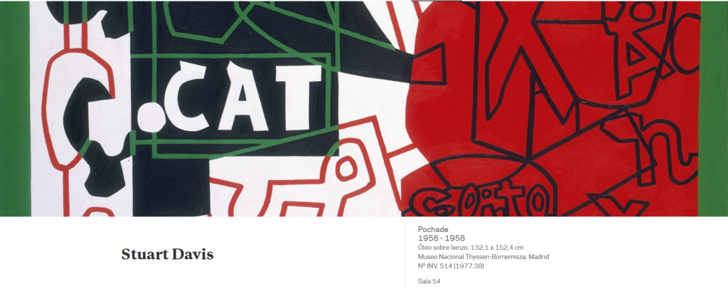
Pochade, painted from 1956 to 1958, belongs to a group of large paintings on canvas from Stuart Davis’s final period in which he reworked the vocabulary of Cubist fragmentation. The painter likewise replaced his earlier stress on colour with a very clear emphasis on the use of drawing. The French word used as a title refers to an outline or quick sketch, although the work is clearly not a sketch in either format or execution. The stress on lettering is heightened by the incorporation of various words into the composition (“ANY, ” “CAT, ” “NEWS” and “Elite”) and the limiting of the colours to black, white, red and green.
Davis discussed the nature of line and drawing at length in his theoretic writings, and, as Gail Levin points out, he made various annotations about its execution in the three preliminary studies on paper for Pochade. To make his obsession with drawing even clearer, he produced two large paintings on canvas with the same image as Pochade but without using colour, thereby demonstrating that it was possible to cause a powerful impact with the most sparing of means.
Pochade, de 1956-1958, pertenece a un conjunto de lienzos de gran formato de la etapa final de Stuart Davis en los que reelaboró el vocabulario de la fragmentación cubista. Asimismo, el pintor reemplazó su anterior acento en el color por una apuesta muy clara por el énfasis en el empleo del dibujo. La misma palabra francesa utilizada como título se refiere a un apunte, a un esbozo, a pesar de que claramente ni por su formato ni por su ejecución se trata de un boceto. La insistencia en el grafismo se incrementa con la incorporación de diversas palabras en la composición («ANY», «CAT», «NEWS» y «Elite») y con la restricción de los colores al negro, blanco, rojo y verde.
En sus escritos teóricos Davis habló mucho sobre la naturaleza de la línea y del dibujo y, como recoge Gail Levin, en los tres estudios previos en papel para Pochade, el artista escribió diversas anotaciones sobre su ejecución. Para dejar aún más clara su obsesión por el dibujo, realizó dos lienzos de gran formato con la misma imagen que Pochade pero sin incorporar color, para demostrar que con los medios más exiguos se podía crear un fuerte impacto.
https://www.museothyssen.org/coleccion/artistas/davis-stuart/pochade
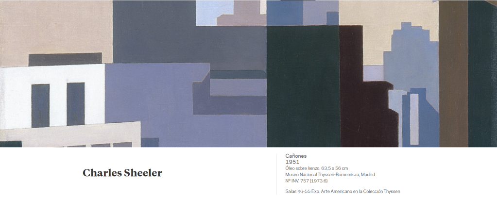
Charles Scheeler: Cañones, 1951
Following his first major one-man show at the prestigious Downtown Gallery in 1931, Sheeler stood out on the New York art scene as one of the most prominent figures of the post- Armory Show generation. A few years later, in 1939, The Museum of Modern Art staged a monographic exhibition of his oeuvre, which brought him relative commercial success and allowed him to abandon advertising jobs and concentrate more on his painting. Towards the end of his life the painter moved into a grand mansion in Ridgefield, Connecticut, though he never lost contact with New York city and kept his studio open.
In Canyons, executed in 1951, Charles Sheeler depicts one of his favourite themes: the urban landscape of New York. In 1920, a year after arriving in the then incipient metropolis, Sheeler collaborated with the photographer Paul Strand in the legendary black-and-white documentary film lasting nearly ten minutes entitled Manhatta, which explored the city’s buildings. The documentary was based on Walt Whitman’s poem Manhatta — the original name of the New York island — from the collection of poems Leaves of Grass, the lines of which served as subtitles of the images. Thenceforward streets and modern buildings became a recurring theme in his photographs and paintings.
Sheeler transforms the streets of New York into deep gorges on account of the height of the skyscrapers. Although, as in other paintings, there are indications that it is inspired by earlier photographs of his and that certain technical effects are borrowed from photography, such as the transparency and double exposures, the image depicted by his paintbrush goes much further than that captured with his camera.
Sheeler wrote that “one-, two-, and three-dimensional space, color, light and dark, dynamic power, gravitation or magnetic forces, the frictional resistance of surfaces and their absorptive qualities, all qualities capable of visual communication, are material for the plastic artist, and he is free to use as many or as few as the moment concern him.” Indeed, in the present painting he flattens and simplifies the buildings to the point of reducing them to their abstract qualities and converting them into mere impersonal constructions. With his particular Precisionist style, which is sometimes defined as Abstract Realism, he renders the basic geometric forms of the skyscrapers using meticulous brushwork and a dull palette of arbitrary and unreal colours. However, his precise, almost mathematic style is combined with an unreal, visionary illumination that makes this painting a melancholic and timeless evocation of the city.
Desde su primera gran muestra individual celebrada en la prestigiosa Downtown Gallery en 1931, Sheeler destacó en el panorama artístico neoyorquino como una de las figuras más destacadas de la generación post- Armory Show. Pocos años después, en 1939, el Museum of Modern Art celebraba una exposición monográfica de su obra que le reportó un relativo éxito comercial y le permitió abandonar los trabajos publicitarios y trabajar con mayor dedicación en su pintura. Al final de su vida el pintor se instaló en una gran mansión en Ridgefield, en el estado de Connecticut, pero no perdió nunca el contacto con la ciudad de Nueva York y siempre mantuvo abierto su estudio.
En Cañones, ejecutado en 1951, Charles Sheeler representa uno de sus temas preferidos: el paisaje urbano de Nueva York. En 1920, un año después de su llegada a la entonces incipiente metrópolis, Sheeler colaboró con el fotógrafo Paul Strand en el mítico filme documental en blanco y negro de casi diez minutos de duración titulado Manhatta, en el que hacían un recorrido por los edificios de la ciudad. El documental está basado en el poema de Walt Whitman Manhatta —nombre original de la isla neoyorquina— recogido en el poemario Hojas de hierba y cuyos versos servían de subtítulos a las imágenes. A partir de entonces, las calles y los modernos edificios se convirtieron en un tema recurrente de sus fotografías y pinturas. Sheeler ha convertido las calles neoyorquinas en profundas gargantas por la altura de los rascacielos. Si bien, como en otras pinturas, se puede adivinar que se inspira en fotografías suyas anteriores y que emplea en el lienzo ciertos efectos técnicos de la fotografía, como las transparencias y las dobles exposiciones, la imagen plasmada con sus pinceles va mucho más allá que la captada con su cámara.
«El espacio —escribía Sheeler— de una, dos y tres dimensiones, el color, la luz y la oscuridad, la gravitación o las fuerzas magnéticas, la resistencia de fricción de las superficies y sus cualidades de impregnación, todas ellas cualidades capaces de producir una comunicación visual, son los recursos del artista plástico, quien es libre de usar muchos o pocos según sus preocupaciones de cada momento». En este lienzo aplana y simplifica los edificios, hasta reducirlos a sus cualidades abstractas y convertirlos en meras construcciones impersonales. Con su peculiar estilo precisionista, definido a veces como realismo abstracto, plasma las geometrías básicas de los rascacielos con una pincelada precisa, una paleta apagada de colores arbitrarios e irreales. Ahora bien, al estilo preciso, casi matemático, se une una iluminación irreal y visionaria que hace de esta pintura una evocación melancólica e intemporal de la ciudad.
https://www.museothyssen.org/coleccion/artistas/sheeler-charles/canones
Piet Mondrian: Composición de colores nº1 con rojo y azul, 1931
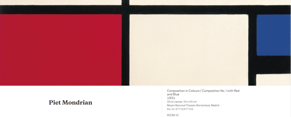
Piet Mondrian was the foremost representative of the geometrical trend in abstract art at the Cubism and Abstract Art exhibition staged in 1936 by Alfred Barr, the first director of New York’s Museum of Modern Art. Barr defined this trend as “the shape of the square confronts the silhouette of the amoeba” and distinguished it from the other, more biomorphic and organic abstract current represented by artists such as Kandinsky and Miró. Although his links to the Dutch Neo-Plasticist group De Stijl were severed in 1925 owing to disagreements with Van Doesburg, Mondrian devoted his whole life and oeuvre to investigating the balance between orthogonal forms and primary colours. This impassioned pursuit of the plastic equivalent of a universal truth makes him one of the most prominent figures of the modern movement. During the course of this process of stripping plastic language to its bare essentials, to a simple weave of verticals and horizontals, the grid structure appeared in his work and, as Rosalind Krauss has pointed out, thereafter became an emblem of modern desires in the field of the visual arts.
To Mondrian geometry was a spiritual principle, a manner of establishing a new universal order vis-à-vis the chaos of nature. Executed in 1931, Composition in Colours / Composition No. I with Red and Blue is a good example of the extreme asceticism of his geometric forms. It also illustrates his pared down artistic vocabulary, which was by then fully defined following his return from Paris, when he published his manifesto on Neo-Plasticism. The grid structure based on flat squares in white or primary colours (in this case only red and blue), separated by thick black lines, follows the principle of dynamic equilibrium which foreshadows the compositions of the late 1930s.
In order to arouse a spiritual feeling of harmony in the viewer, as advocated by Neo-Plasticism, Mondrian believed that the artist should conceal his personality as far as possible. However, paradoxically, the geometrical structure of his paintings was not dictated by mathematical laws but by his own intuition. Indeed, when examined under infra-red light, the painting in the collection displays various hidden lines drawn in charcoal, which are proof of the changes he made to the composition before deciding on the final arrangement.
The painting’s exhibition history is very long and, as can be seen in the photograph of the installation of the exhibition at Paul Citroen’s Nieuwe Kunstschool held in Amsterdam in 1935, its original white frame is still in place.
En la exposición Cubismo y arte abstracto que Alfred Barr, el primer director del Museum of Modern Art de Nueva York, organizó en 1936, Piet Mondrian destacaba como el máximo representante de la corriente geométrica de la abstracción. Barr la definía como «la forma del cuadrado enfrentada a la silueta de la ameba» y la diferenciaba de la otra corriente abstracta más biomórfica y orgánica, representada por figuras como Kandinsky o Miró. Aunque su vinculación al grupo neoplasticista holandés De Stijl finalizó en 1925 por desavenencias con Van Doesburg, Mondrian dedicó toda su vida y su obra a la investigación del equilibrio de las formas ortogonales y los colores primarios. Esa apasionada búsqueda del equivalente plástico de una verdad universal hace de él uno de los principales protagonistas del movimiento moderno. En ese proceso de reducción del lenguaje plástico a sus elementos básicos, a una simple trama de verticales y horizontales, apareció en su obra la estructura de la retícula que, como ha señalado Rosalind Krauss, se convirtió a partir de entonces «en emblema de los anhelos modernos, en el ámbito de las artes visuales».
Para Mondrian la geometría era un principio espiritual, un modo de establecer un nuevo orden universal frente al caos de la naturaleza. Composición de colores/ Composición n.º I con rojo y azul, de 1931, es un buen ejemplo del ascetismo extremo de sus formas geométricas, de su simplificado vocabulario artístico, que se encontraba ya plenamente definido desde su regreso a París, cuando publicó su manifiesto del neoplasticismo. La estructura de cuadrícula, a base de cuadrados planos, blancos o de colores primarios (en este caso sólo rojo y azul), separados por gruesas líneas negras, sigue aquí el principio de equilibrio dinámico que anticipa las composiciones de finales de la década de los años treinta.
Para provocar en el espectador un sentimiento espiritual de armonía, tal y como aclamaba el neoplasticismo, Mondrian consideraba que el artista debía encubrir al máximo su personalidad. Ahora bien, paradójicamente, la estructura geométrica de sus pinturas no estaba dictada por las leyes matemáticas sino por su propia intuición. De hecho, en la pintura de nuestra Colección las pruebas con rayos infrarrojos muestran varias líneas ocultas, trazadas con carboncillo, que son prueba de las variaciones a las que sometía la composición antes de decidir la disposición final.
El historial de exposiciones de este lienzo es muy extenso y, como se puede apreciar en la fotografía del montaje de la exposición de la Nieuwe Kunstschool de Paul Citroen, celebrada en Amsterdam en 1935, la obra poseía el mismo marco blanco que tiene en la actualidad.
https://www.museothyssen.org/coleccion/artistas/mondrian-piet/composicion-colores-composicion-no-i-rojo-azul
Piet Mondrian: New York City, 3, 1941
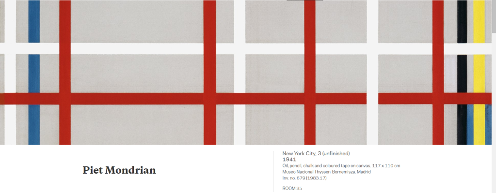
In view of the Nazi advance, in 1938, after the signing of the Treaty of Munich, Piet Mondrian decided to abandon Paris, his city of residence for nearly twenty years, and moved to London, where his friends Ben and Winifred Nicholson found him a studio in Hampstead. Two years later, following the air raids on London and the German occupation of Paris, he decided to accept the invitation of the young American painter Harry Holtzman and settled in New York, where he spent the last years of his life. The exodus of European artists to America was a widespread phenomenon during those years and for all of them the new physical and intellectual environment brought about changes in their art.
As a result of the impact of Manhattan and American culture, coupled with the interest Mondrian had developed in jazz music years earlier, his painting lost its previous rigidity and acquired greater freedom and a more lively rhythm. From the outset he was powerfully attracted by the dynamism of the great metropolis, its quadrangular layout and its towering buildings which, as he used to say, were “the furthest from nature, ” but also by the latest developments in rhythm and counter-rhythm in jazz and by the new boogie-woogie style that had fascinated him earlier in Paris.
In 1983 the New York Museum of Modern Art staged an exhibition of the “Studio-wall compositions, ” the paintings found in his last studio on 59th Street at his death. Among them was the New York City, 3 in the Museo Thyssen-Bornemisza, which was previously called New York City, New York or New York City IV until Joop Joosten established the current title as original and definitive in the catalogue raisonné of the work of Mondrian. As a rule, Mondrian kept works in his studio for long periods and made successive alterations until achieving the desired balance between line and colour. Joosten mentions a first state of the present canvas, entitled Composition with Yellow and Blue, possibly begun in 1938. According to this information, the present painting should be included among the seventeen works, some unfinished and others complete, which the artist took with him from London to New York and which have been called the “Transatlantic paintings.”
The works Mondrian produced in America have been studied not only as a consequence of the effect the city had on the artist, but also from the point of view of the new technique they introduce. The thick black lines delimiting the fields of colour in his earlier works were replaced by a new material that broke away from the principle of flatness and facilitated his work: coloured adhesive tape. The fact that the strips of tape could be moved allowed him to modify their arrangement on the white canvas until achieving the most satisfactory and balanced layout for the composition. His initial endeavour to discover the harmony between surface, form and colour was now coupled with a new, more dynamic language. The final stage involved replacing the tapes with coloured painted strips, but this operation was only performed in one of the works in the series, New York City. The rest were left unfinished and should therefore be regarded as works in progress, in a state that Christopher Green aptly described as “suspended irresolution.”
According to the testimony of Professor Martin S. James, owing to its delicate state the painting was restored in 1977 by Bill Steeves and Harry Holtzman, Mondrian’s painter friend who managed his Estate. They reattached the tapes that had come loose and replaced those that were torn, taking care not to alter the colour or original arrangement.
En el año 1938, a la vista del avance nazi y tras la firma del Tratado de Múnich, Piet Mondrian decidió abandonar París, donde había residido casi veinte años, y trasladarse a Londres, ciudad en la que sus amigos Ben y Winifred Nicholson le consiguieron un estudio en Hampstead. Dos años después, tras los bombardeos de la capital británica y la entrada de los alemanes en París, decidió aceptar la invitación del joven pintor americano Harry Holtzman y se instaló en Nueva York, donde pasaría los últimos años de su vida. El éxodo de artistas europeos a América fue un fenómeno generalizado en esos años y también fue común a todos ellos la transformación de su arte debido al cambio de ambiente físico e intelectual.
Como consecuencia del impacto que le produjeron Manhattan y la cultura americana, al que se sumaba su interés por la música jazz, nacido años atrás, la pintura de Mondrian perdió la rigidez anterior y adquirió una mayor libertad y un ritmo más vivo. Desde un primer momento se sintió fuertemente atraído por el dinamismo de la gran metrópoli, por su configuración cuadrangular y sus elevados edificios que, como él solía decir, eran «lo más lejano a la naturaleza», pero también por los últimos hallazgos del jazz en cuanto a ritmo y contrarritmo, por el nuevo boogie-woogie, que ya le habían fascinado en París.
En 1983 el Museum of Modern Art de Nueva York organizó una exposición sobre las «Studio-wall compositions», las pinturas que se encontraron a su muerte en su último estudio, situado en la calle 59. Entre ellas estaba New York City, 3, del Museo Thyssen-Bornemisza, una obra que había sido titulada con anterioridad como New York City, New York o como New York City IV, hasta que Joop Joosten, en el catálogo razonado de Mondrian, establece el actual título como original y definitivo. Por regla general, Mondrian mantenía sus obras en el estudio durante largos periodos de tiempo y hacía modificaciones sucesivas hasta conseguir el deseado equilibrio entre líneas y colores. Joosten menciona un primer estado de este lienzo, titulado Composición con amarillo y azul, iniciado posiblemente en 1938. Según estos datos, nuestra pintura debe incluirse entre las diecisiete obras, algunas inconclusas y otras ya terminadas, que el artista llevó consigo de Londres a Nueva York, a las que se ha denominado «Transatlantic paintings».
El conjunto de obras americanas de Mondrian no sólo ha sido estudiado como consecuencia del efecto producido por la ciudad en el artista, sino también desde el punto de vista de la introducción de una nueva técnica. Las gruesas líneas negras, que delimitaban los campos de color en sus obras anteriores, fueron sustituidas por un nuevo material que rompía con el principio de planitud y que facilitaba su trabajo: la cinta adhesiva de colores. La reversibilidad de las cintas le permitía modificar su colocación sobre el lienzo blanco, hasta lograr situarlas en los lugares que le parecían más satisfactorios y compensados para la composición. A su esfuerzo preliminar por descubrir la armonía entre superficie, forma y color, se unió entonces un nuevo lenguaje más dinámico. La fase final consistía en reemplazar las cintas por líneas de colores pintadas, pero esta operación sólo la llevó a cabo en una de las obras de la serie, New York City. Las demás se quedaron inacabadas y, por tanto, deben ser consideradas obras en proceso de elaboración, conformando lo que Christopher Green ha definido acertadamente como «una indecisión suspendida».
Según el testimonio del profesor Martin S. James, debido a su delicado estado, la pintura fue restaurada en 1977 por Bill Steeves y Harry Holtzman, el pintor amigo de Mondrian que gestionaba su Sucesión, quienes pegaron de nuevo las cintas que estaban sueltas y sustituyeron las que estaban rotas, procurando no alterar ni el color ni la disposición original.
https://www.museothyssen.org/coleccion/artistas/mondrian-piet/nueva-york-3-inacabado
László Moholy-Nagy: Segmentos de círulo, 1921
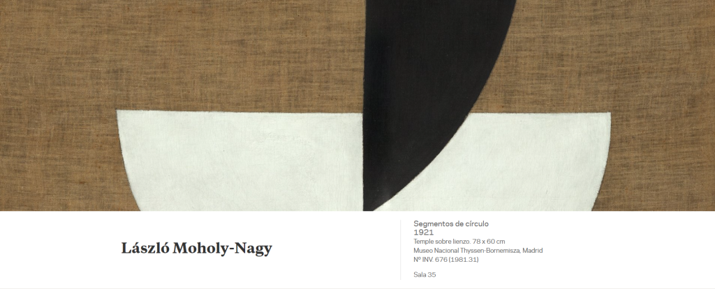
The influence of Russian Constructivism, especially that of El Lissitzky, who visited Berlin in the early 1920s, led Moholy-Nagy to endeavour to express eternal values in his works through pure geometric forms that do not exist in the natural world. Similarly, like the Suprematist and Constructivist artists, he devoted much of his oeuvre to seeking a balance between opposite values such as black and white, stillness and motion, horizontality and verticality, and action and reaction. In the Thyssen-Bornemisza Circle Segments, the artist explores the relationship between heaviness and lightness. The basic lines of the composition — a set of two semicircles positioned vertically and horizontally, respectively, which he went on to repeat in numerous works — and the technique employed attest to his effort to eliminate as far as possible any references to the personal hand of the artist by using pure forms and clean, smooth, flat surfaces.
The first owner of the work was Ida Bienert, a collector of the oeuvre of artists like Mondrian, Chagall, Malevich and Moholy-Nagy, who commissioned the interior design of her Dresden home from Piet Mondrian in 1925.
La influencia del constructivismo ruso, en especial de El Lissitzky, que visitó Berlín a comienzos de la década de 1920, llevaría a Moholy-Nagy a querer plasmar en sus obras valores eternos a través de formas geométricas puras, inexistentes en el mundo natural. Asimismo, en la misma línea que los artistas suprematistas y constructivistas, dedicó gran parte de su obra a la búsqueda del equilibrio entre valores opuestos: como el negro y el blanco, el estatismo y el movimiento, la horizontal y la vertical, o la acción y la reacción. En el caso de Segmentos de círculo, de la colección Thyssen-Bornemisza, el artista investiga sobre la relación entre lo pesado y lo liviano. Tanto en las líneas básicas de la composición, un juego de dos semicírculos colocados en vertical y horizontal, respectivamente, que repetirá en numerosas obras, como en la técnica utilizada se puede apreciar su esfuerzo por eliminar al máximo cualquier posible referencia a la mano personal del artista, a través de unas formas puras y unas superficies planas, limpias y lisas.
La primera propietaria de la obra fue Ida Bienert, la coleccionista de artistas como Mondrian, Chagall, Malévich y el propio Moholy-Nagy, que en 1925 encargó el diseño interior de su casa de Dresde a Piet Mondrian.
https://www.museothyssen.org/coleccion/artistas/moholy-nagy-laszlo/segmentos-circulo
Josef Albers: Constelación estructural. Alfa, 1954
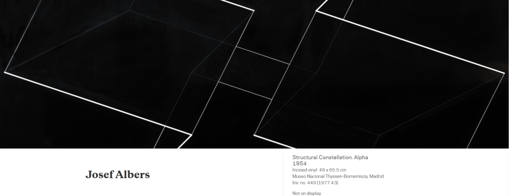
Structural Constellation. Alpha, executed in 1954, belongs to a series of drawings and engravings which Albers began in 1950 and continued to work on for several years, and which embody his experiments on visual ambiguity. His chief ambition as a teacher, first at the Bauhaus and later at Black Mountain College and Yale University, was to train his students to open their eyes. The central idea of this body of works appears to stem from this principle; indeed, representation, on account of its special configuration, becomes an irrational and illusory visual image as it shows forms that contradict geometry itself and could never exist in three dimensions in real life. The artist seeks to explain that even if the form depicted is unique, its geometry is variable and a single image holds two or several different visions, anticipating Op Art.
In the present work belonging to the Museo Thyssen-Bornemisza, Albers explores right angles and parallel lines and requires the viewer to make a special effort to attempt, albeit unsuccessfully, a rational understanding of the geometrical shape. The simplicity of the structure and the painstaking execution of the drawing, which is engraved on vinyl, and the absence of colour, give the image a precise and impersonal appearance that further heightens the illogical appearance of the figure.
Constelación estructural. Alfa, de 1954, pertenece a una serie de dibujos y grabados, iniciada por Albers en 1950 y desarrollada durante varios años, en la que plasmó sus indagaciones sobre la ambigüedad visual. Su principal ambición como profesor, primero en la Bauhaus y más tarde en el Black Mountain College y en la Yale University, fue educar a sus alumnos a abrir los ojos. La idea central de este conjunto parece responder a este principio, y la representación, por su especial configuración, se convierte en una imagen visual irracional e ilusoria, ya que nos muestra formas que contradicen la propia geometría y que además nunca podrían existir en tres dimensiones en la realidad. El artista quiere explicar que aunque la forma representada sea única, su geometría es variable y en una sola imagen se concentran dos o varias visiones diferentes, con lo que se anticipa al op-art.
En este ejemplo del Museo Thyssen-Bornemisza, Albers investiga sobre los ángulos rectos y las líneas paralelas y nos obliga a hacer un esfuerzo especial para intentar comprender de forma racional, aunque sin éxito, la figura geométrica. La sencillez de la estructura, unida a la cuidada y minuciosa ejecución del dibujo, grabado sobre una plancha de vinilo, y la ausencia de color, dan a la imagen un aspecto preciso e impersonal que acrecienta aún más el aspecto ilógico de la figura.
https://www.museothyssen.org/coleccion/artistas/albers-josef/constelacion-estructural-alfa
Frank Stella: Sin título (1966)
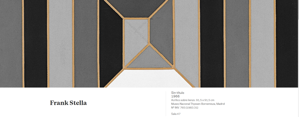
Frank Stella made himself known at the Sixteen Americans exhibition organised by The Museum of Modern Art in New York in 1959 with his Black Paintings. These geometrically structured works far removed from gestural abstraction had been executed under the influence of Jasper Johns’s Flags — paintings totally devoid of any spatial dissociation between form and content, which had been first shown at Leo Castelli’s gallery in 1958. However, as his greatest champion the critic Michael Fried stated, the new forms in Stella’s paintings structured images deductively, internally, with no need for “found” images such as Johns’s flags.
The present painting in the Thyssen-Bornemisza collection was executed in 1966, when Stella’s abstract language was verging on minimalist experimentation. In formal terms the scheme of the composition is very simple: a series of nested squares that cover the entire surface of the canvas and, through the changes in colour on each of their sides, create a spiral movement that could stretch beyond the limits of the painting. Stella replaces the exaggerated gestures of the Abstract Expressionists with a carefully studied geometrical network of parallel lines arranged with certain symmetry. However, the methodical nature of his painting does not stem from strict geometrical principles but from an intuitive geometry, in order to ensure that the viewer grasps it at first glance and is accordingly moved by it. “The worthwhile qualities of a painting are always going to be both visual and emotional, ” he stated, “and it’s got to be a convincing emotional experience. Otherwise it will not be a good — not to say, great — painting.”
Stella was equally concerned with underlining the presence of the painting as a physical object and therefore believed that the viewer ought to be able to see how it was put together: “There are two problems in painting. One is to find out what painting is and the other is to find out how to make a painting.” In the present painting, in order to stress the importance of the work as an object rather than as an illusion, he employs very matte acrylic paint. This object-like quality is further emphasised by the use of a very thick stretcher that causes the work to stand out. The artist stated in this connection that “my painting is based on the fact that only what you can see there is there. It is really an object.”
Frank Stella se dio a conocer en la exposición Sixteen Americans, organizada por el Museum of Modern Art de Nueva York en 1959 con sus Black Paintings. Estas obras de estructura geométrica que se alejaban de cualquier gestualidad habían sido efectuadas bajo la influencia de las Flags de Jasper Johns, unas pinturas que anulaban cualquier disociación espacial entre forma y fondo, y que habían sido presentadas en 1958 en la galería de Leo Castelli. Ahora bien, como exponía su principal valedor, el crítico Michael Fried, las nuevas formas de las pinturas de Stella estructuraban las imágenes deductivamente, internamente, sin necesidad de una imagen encontrada, como en el caso de las banderas de Johns.
Esta pintura de la colección Thyssen-Bornemisza fue realizada en 1966, cuando el lenguaje abstracto de Stella se acercaba a la experimentación minimalista. En términos formales, el esquema de la composición es muy simple, contiene una serie de cuadrados concéntricos que cubren toda la superficie del lienzo, los cuales, a través de los cambios de color en cada uno de los lados, forman un movimiento en espiral que podría extenderse fuera de los límites del cuadro. Stella sustituye los exagerados gestos de los expresionistas abstractos por una estudiada red geométrica de líneas paralelas que tienen una cierta simetría. Sin embargo, el carácter metódico de su pintura no responde a unos principios geométricos estrictos sino a una geometría intuitiva con el propósito de que la obra pueda ser captada en una única mirada con la intención de emocionar: «Las cualidades universales de la pintura —declaraba— siempre serán visuales o emocionales y para que una obra sea buena —por no decir grandiosa— tiene que ofrecer una experiencia emocional convincente».
Asimismo, Stella quería enfatizar la presencia del cuadro como objeto físico y por tanto consideraba que debía quedar a la vista su elaboración: «Hay dos problemas en la pintura —exponía—.Uno es averiguar qué es la pintura y el otro es averiguar cómo es una pintura». En el presente ejemplo, para recalcar la importancia de la obra como objeto más que como ilusión, emplea una pintura acrílica muy mate. Esta cualidad objetual se subraya aún más con la utilización de un bastidor muy grueso que hace resaltar la obra a los ojos del espectador. En este sentido el artista declaraba: «Mi pintura se basa en el hecho de que sólo lo que puede verse allí, está allí. Es en verdad un objeto».
https://www.museothyssen.org/coleccion/artistas/stella-frank/sin-titulo
Joan Miró: El pájaro relámpago cegado por el fuego de la luna (1955)
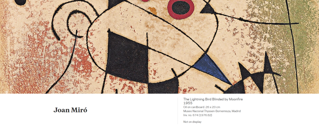
As Tomàs Llorens recently pointed out, in most of the pictures Miró painted between 1944 and 1955 we find a figurative vocabulary derived from Les Constellations. These twenty-three gouaches on paper featuring a motley array of shapes, stars and circles, as if a magical constellation of the cosmos, served the painter as a sort of exorcism or escapism from the horrors of war.
The Lightning Bird Blinded by Moonfire, executed in 1955, is one of the paintings that are often associated with this series. In the composition various linear forms and patches of colour are connected with each other over a flat background with a surprising musicality and lyricism. The colours are applied without modulation and are very sharply outlined, while the coloured background has a nebulous, highly luminous appearance that causes the whole painting to seem to float in an ethereal space. The descriptive and poetic title enables us to identify some of the basic elements of the painting.
Como ha señalado recientemente Tomàs Llorens, en la mayor parte de los cuadros de Miró pintados entre 1944 y 1955 encontramos un vocabulario figurativo que deriva de Les Constellations. Estos veintitrés gouaches sobre papel en los que aparece un abigarrado conjunto de formas, estrellas, círculos, como si se tratara de una constelación mágica del cosmos, fueron para el pintor como una suerte de exorcismo o de escape de los horrores de la guerra.
El pájaro relámpago cegado por el fuego de la luna, de 1955, es una de las pinturas que frecuentemente se pone en relación con esta serie. En la composición, diferentes formas lineales y varias manchas coloreadas se conectan entre sí sobre un fondo plano con una musicalidad y un lirismo sorprendentes. Los colores han sido aplicados sin modulaciones dentro de unos contornos muy precisos, mientras que el fondo de color adquiere una calidad nebulosa y una gran luminosidad, lo que permite que todo el conjunto parezca flotar en un espacio etéreo. Por otra parte, el descriptivo y poético título nos permite reconocer algunos de los elementos básicos del cuadro.
https://www.museothyssen.org/coleccion/artistas/miro-joan/pajaro-relampago-cegado-fuego-luna
Henri de Toulouse-Lautrec: Yvette Guilbert (1893)
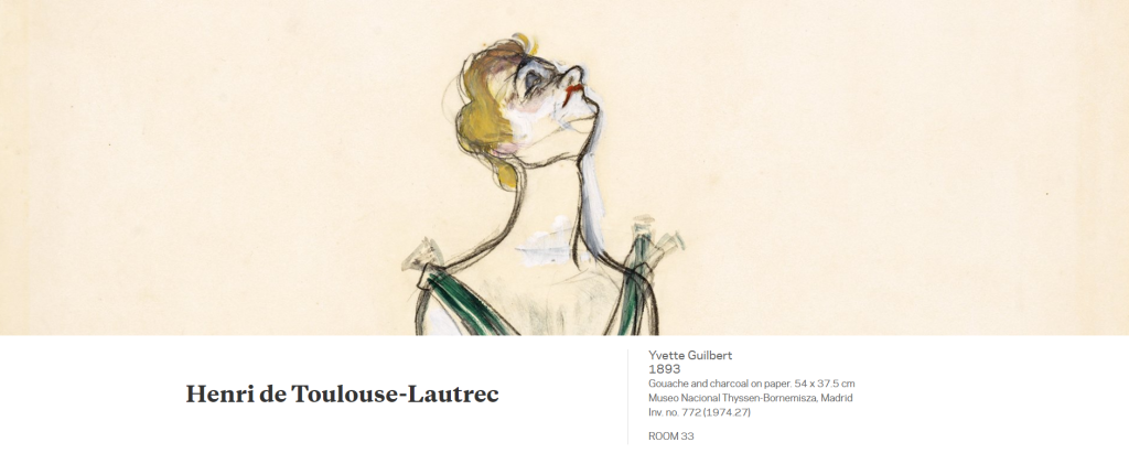
Henri de Toulouse-Lautrec always harboured a keen fascination with the world of the theatres and cafés-concerts of Paris, which he depicted in numerous works, exhibiting his impressive powers of observation. The famous singer Yvette Guilbert (1867‒1944), a genuine star of the Divan Japonais, Ambassadeurs and Moulin Rouge cabarets in fin-de-siècle Paris, had met Toulouse Lautrec at the beginning of 1893 through the writer Maurice Donnay and had become one of the painter’s favourite vedettes. In this portrait, which was used to illustrate Gustave Geffroy’s article on cafésconcerts in Le Figaro Illustré in 1893, Yvette is depicted on the edge of the stage, in a stiff pose — haughty even — about to perform the de rigueur curtsey between rounds of applause. According to the singer’s memoirs, he had copied her chignon and pale makeup from a wax head in the Musée de Lille and her long V-necked dress from Albert Besnard’s Portrait of Mme Roger Jourdain.
For a time the work belonged to the French silent film actor Max Linder (Maximilien Gabriel Leuvielle, 1883–1925).
Henri de Toulouse-Lautrec siempre sintió una gran fascinación por el mundo de los teatros y los cafés-concierto de París, que representó en numerosas obras haciendo gala de sus grandes dotes de observación. La famosa cantante Yvette Guilbert (1867-1944), verdadera estrella de los cabarets El Diván Japonés, Ambassadeurs o Moulin Rouge en el París de fin de siglo, había conocido a Toulouse-Lautrec a comienzos de 1893 a través del escritor Maurice Donnay y se había convertido en una de las vedettes preferidas del pintor. En este retrato suyo, que sirvió de ilustración del artículo dedicado a los cafés-concierto por Gustave Geffroy en Le Figaro Illustré en 1893, Yvette aparece al borde del escenario, en una pose rígida, incluso altiva, a punto de hacer la reverencia de rigor entre aplausos. Según relató la cantante en sus memorias, su peinado recogido y el maquillaje claro los había copiado de una cabeza de cera del Musée de Lille y su vestido largo con escote en pico, del Retrato de Mme. Roger Jourdain de Albert Besnard.
La obra perteneció durante un tiempo al actor de cine mudo francés Max Linder (Maximilien Gabriel Leuvielle, 1883-1925).
https://www.museothyssen.org/coleccion/artistas/toulouse-lautrec-henri/yvette-guilbert

Deja un comentario